Dear Czech-BioImaging Users and Friends,
with the beginning of the new year, we are pleased to announce the launch of the new visual identity of Czech-BioImaging. This update reflects the steady development and growth of our research infrastructure, as well as our effort to keep pace with recent trends in imaging and scientific communication. It also mirrors the expanding user community we serve and our ongoing commitment to quality, scientific excellence, reliability, and continuity.
Our new logo builds on the foundations of the previous one. It retains our signature blue colour to preserve continuity, while its simplified and modernised form improves clarity and readability across formats. The refreshed visual identity introduces a unified system that strengthens our communication across all facilities and enhances how we present Czech-BioImaging to the wider public.
Why we refreshed our identity
As Czech-BioImaging continues to grow, so does our responsibility to communicate clearly and consistently with our users, collaborators, and partners in the Czech Republic and abroad. A strong and coherent visual identity helps us represent who we are today and how our infrastructure has evolved over the years.
The refreshed identity enables us to:
- present a unified and recognisable brand,
- support communication across our scientific, educational, and outreach activities,
- reflect the precision and innovation that define the imaging technologies we provide,
- and further strengthen our position within the national and European research infrastructure landscape.
The new identity is the outcome of a thoughtful design process carried out in collaboration with graphic designer Martin Vosátka. It is grounded in our long-term mission, shaped by feedback from our community, and guided by the principles set during the development of our brand.
A logo inspired by imaging
The new Czech-BioImaging logo is grounded in the visual language of imaging.
Its concentric, rotational elements reference lens adjustment and focus, symbolising precision, clarity, and the interconnected network of our facilities.
The accompanying logotype ensures readability and a modern, clean presentation suitable for both digital and print environments.
Together, the symbol and wordmark create a clear and flexible logo system that represents our scientific focus and the collaborative nature of Czech-BioImaging.

A colour palette built for clarity and impact
Our updated colour palette is designed to support clear communication while remaining visually distinctive. It is based on four primary tones:
- Sea Blue (#108AC0) – expressing clarity, precision, and focus
- Purple Heart (#522ECC) – adding depth and energy
- Wild Sand (#F5F5F5) – providing a clean, neutral background
- Black – ensuring legibility and contrast
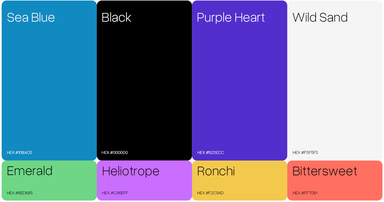
A complementary secondary palette expands the system for posters, outreach materials, and digital communication, allowing flexibility without losing consistency.
Typography that supports readability
The primary typeface, Open Sauce One, was chosen for its balance of modern design and excellent readability. A clear typographic structure helps us communicate scientific content in a way that is accessible, precise, and visually coherent. Where required, Roboto serves as a reliable replacement.

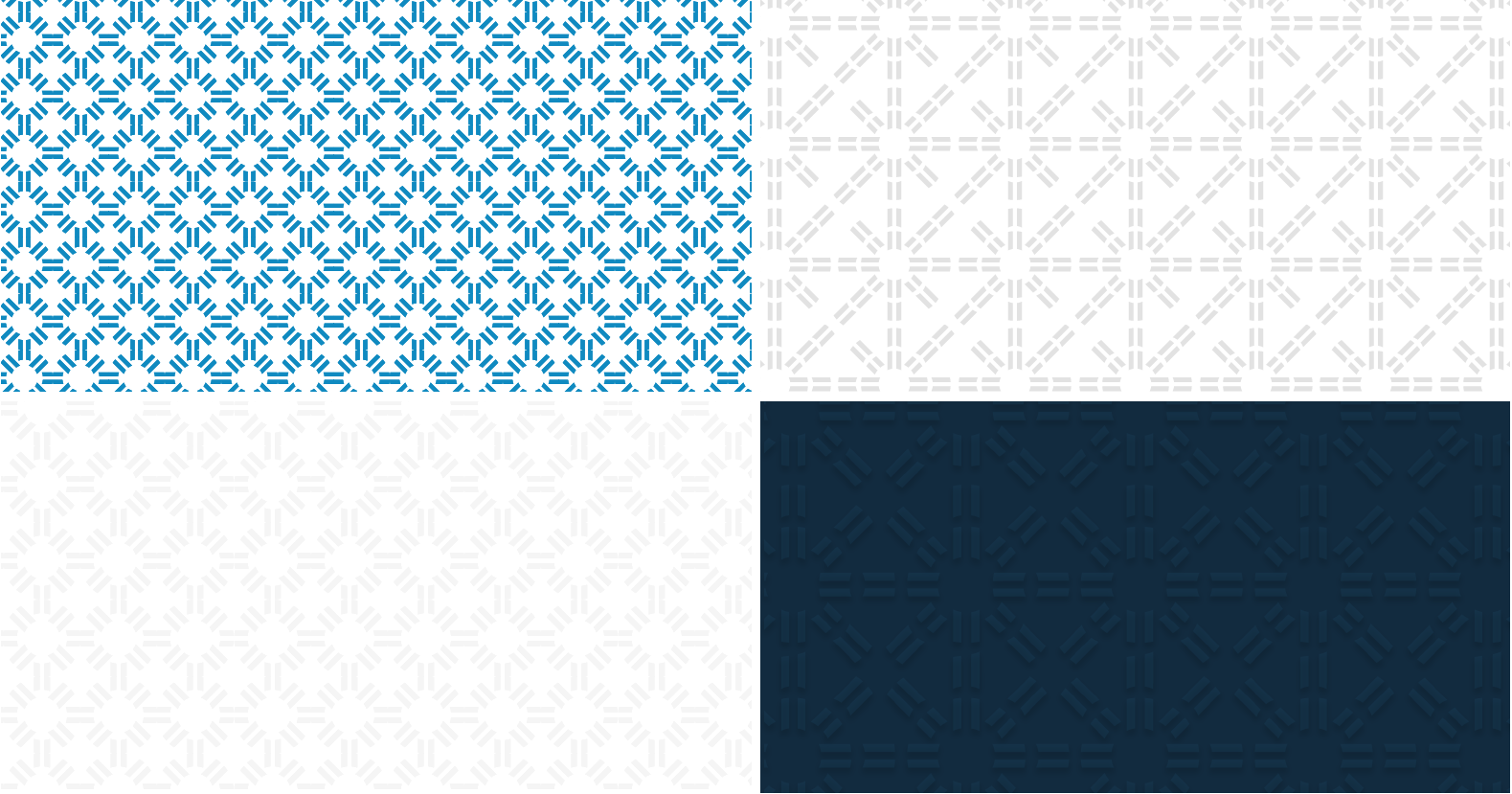
Patterns derived from our core symbol
The new brand identity incorporates a modular pattern system derived directly from the logo symbol. These patterns can be used in both subtle and expressive applications — from digital backgrounds to printed materials — helping create a unified visual environment across Czech-BioImaging.
Where will the new identity appear?
The updated identity will gradually be introduced across:
- the Czech-BioImaging website,
- user communication,
- facility materials and templates,
- training, posters, and presentations,
- social media and promotional materials.
Our goal is to make the transition smooth and ensure that all materials reflect the same high standard of clarity, professionalism, and visual cohesion.
A brand that represents our community
This new visual identity underscores our long-standing commitment to open access, expert support, and high-quality imaging services. It also reflects the collaborative nature of our infrastructure — shaped by the work of our facilities, the contributions of our staff, and the creativity and needs of our users.
We look forward to presenting Czech-BioImaging with an identity that supports our mission and strengthens the visibility of the imaging community in the Czech Republic and beyond.


